An interactive introduction to the terrific experience of rendering Arabic typography and its technical debt
Once upon a time, a frontend ticket landed on my queue which was not properly mine, but the only other Arabic reader on the team was on leave. It went roughly as follows; a block of mixed-content Arabic prose on the customer-facing dashboard was rendering with a ragged left edge (the rag falls on the left in Arabic, since the lines set out from the right margin; the ticket said "ragged right") when the design team had explicitly specified justified text. Attached were three screenshots from three browsers and a polite note from the product manager observing that the Latin-script version of the same block looked, I quote, "fine."
The same six months I had closed three other tickets against the same product, each of which had presented to its filer as the only bug. A customer's name had appeared with its letters unjoined on a printed agreement, the way a sign-painter would have laid them out in 1962, because the PDF library on the receipt server pre-dated the existence of a shaping engine in its language runtime. A search index had been returning empty for accounts the customer service team could see in the database because a 2017 import had encoded twelve thousand names using fossil Unicode codepoints from 1991 instead of regular ones from 1995, and the index, very reasonably, treated the two encodings as different strings, So, that ragged-left ticket was the smallest of the four, HOWEVER, it sat on top of the same iceberg and pointed at the same thing.
Here is the disagreement, reproduced live. I used random text, the original had more spacing, I'm too lazy to pick words to maximize the ragging and spacing.
text-align: justify(For these demonstrations this site ships its first webfont ever: Amiri, self-hosted, a hundred and fifty kilobytes of one man's unpaid evenings, redistributed under the OFL. That this is what it takes to show you something your operating system cannot do on its own is, I want to be clear, part of the argument. I think it is a delightful hundred and fifty kilobytes.)
It did look fine. I spent about half an hour with it, I walked the rendered DOM, I set text-align: justify in so many different combinations of font-family and direction declarations, and at the end of the exercise I wrote a reply explaining, more or less honestly, that the problem was not a bug in our stylesheet but the state of Arabic typography on the web.
The reply took and the closure of the ticket took half an hour or so. The reasons behind it took five hundred years to pile up, and they involve a twice-mutilated vizier, a Qurʾān that vanished for four centuries, a Beirut newspaperman with a deadline, and an Egyptian physician who taught himself font engineering for fun (or that what I imagine about him). Walking through these, ended up to be the most enjoyable couple of weeks in that job, and I want to go through it here too.
What the scribes solved
The history deserves recording because almost nobody outside the small world of Arabic font engineering knows it, and it is wonderful. Classical Arabic typography, by which I mean the manuscript tradition that the early printers of Istanbul and Bulaq spent their careers chasing, justifies a line of text without stretching the spaces between words at all. Stretched spaces are the Latin convention, and in Arabic they produce an effect the scribes would have found simply ugly. Instead the scribe extends the letterforms themselves along the baseline, using what is called taṭwīl or, in the modern technical vocabulary, kashida: the connecting strokes between certain pairs of letters can be lengthened, sometimes lavishly, to carry a line out to the margin. A well-set page of Naskh from the seventeenth century has every line flush at both margins, and the result is the dense, regular weave that anyone who has spent time with a good manuscript Qurʾān will recognise on sight.
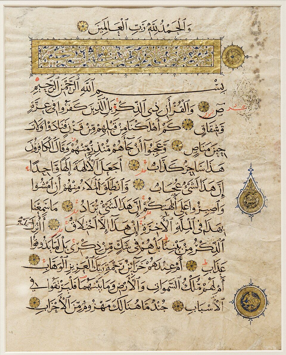
And this was not improvisation but a system, with a paper trail. The system was written down by Ibn Muqla, Abbasid vizier and chief calligrapher, who served three caliphs in succession and was imprisoned by two of them; the third had his right hand amputated on a charge of treasonous correspondence, and Ibn Muqla then kept writing for the next several months by lashing a reed pen to the stump of his wrist, and was rewarded for what he wrote by having his tongue cut out, and died in prison around the year 940. His body was buried three times in three different places, his daughter moving it after each interment to keep the grave out of police hands. The system he wrote down outlasted everybody who hurt him by a thousand years. It is called al-khaṭṭ al-mansūb, the proportional script; every letterform measured in rhombic dots of the reed nib, every curve a defined arc of a defined circle, the alif a fixed number of dots high and everything else derived from the alif. Within that system the elongation is a drawn stroke with its own rules, which letter pairs accept it, how the curve swells and tapers, how many elongations a line may carry, where they may sit. The scribes also justified by choosing different shapes, because most letters have alternate forms of different widths, and a skilled hand selects among them as the margin approaches. Justification, in this tradition, is not a spacing problem rather a shaping problem.
The tradition Ibn Muqla started did not stay with him; it was refined, in writing, by named human beings over the following six hundred years. Ibn al-Bawwāb in Baghdad, around the year 1022, smoothed out the proportions and produced the manuscript that defined Naskh for the rest of the millennium; a single Qurʾān in his hand survives in Istanbul's Chester Beatty Library, and you can date the entire Persian, Ottoman, and Mamluk traditions by how closely they follow it. Yāqūt al-Mustaʿṣimī, who survived the Mongol sack of Baghdad in 1258 by climbing a minaret and continuing to write, codified what later scholars called the Six Pens, the canonical hands of Naskh, Thuluth, Muḥaqqaq, Rayḥān, Tawqīʿ, Riqāʿ, each with its own metrics, each with its own justification grammar. Then the Persian scribes invented Nastaʿlīq in the fourteenth century, a hanging script that justifies by sloping the baseline downward at the end of each phrase, which is to ordinary justification roughly what a vertical garden is to a lawn. The Ottomans developed Dīwānī for the chancery and a tightly knotted Dīwānī Jalī for the sultanic seal, both of which fill space by interleaving letters at heights ordinary baselines never visit. All of these are the same alphabet of twenty-eight letters; all of them have their own rules about which letters accept the kashida, which never do, and how the line breathes.
Latin typesetting never needed any of this, because Latin letters do not hold hands. Arabic letters do, and the web, in 2026, looks at them holding hands and stretches the air between the words anyway. Which means you already know what the mockup card at the top of the page was doing: it is a page of this manuscript tradition, faked in HTML, every line carried to the measure by the strokes and not the spaces. The fakery, since I promised a confession; the elongations are U+0640 TATWEEL characters that I placed and sized by hand.
Four shapes for every letter
To understand why every machine since Gutenberg has wrestled this script and mostly lost, you need one structural fact, and it is a lovely one: Arabic is cursive always. There is no print-versus-handwriting distinction, no block letters. The letters connect in stone inscriptions, in manuscripts, in metal, on screens. Each letter therefore changes shape depending on its neighbours (an isolated form, an initial, a medial, a final), and six letters refuse to connect forward at all, which breaks words into joined clusters and gives the script its rhythm. The shapes are not costumes over some underlying "real" letter. The positional variation is the letter.
And the alphabet is bigger than Arabic the language. Persian extends it with four letters Arabic does not have (پ pe, چ che, ژ zhe, گ gaf) and uses two of the existing letters in subtly different forms (ی for the final yāʾ, ک for kaf). Urdu adds an aspirated do-chashmī he (ھ), a retroflex set (ٹ ڈ ڑ), and a hanging ye barree (ے), and writes most of its everyday text in Nastaʿlīq, which a Naskh-shaped font will produce as a phonetically correct but visually unrecognisable approximation. Sindhi has more again. Pashto, Kurdish, Uyghur, Kashmiri, and Punjabi each take the alphabet, add what their phonology requires, and ship. Any font that calls itself "Arabic" without consulting the Persian and Urdu communities will produce, for hundreds of millions of readers in Iran and South Asia, text that is technically rendered but functionally wrong: the kaf has the wrong terminal, the heh fuses where it shouldn't, the digits are from the wrong belt. The Noto Sans Arabic family ships separate sub-fonts to cover these (NotoNaskhArabic, NotoNastaliqUrdu, NotoSansArabicUI), and OS font fallback chains usually get it right; usually is doing a lot of work in that sentence.
| stored codepoint | isolated | initial | medial | final |
|---|---|---|---|---|
| U+0639 ʿAYN | ع | عـ | ـعـ | ـع |
| U+0647 HEH | ه | هـ | ـهـ | ـه |
The modern answer, the right answer, arrived at after decades of wrong ones, is that the encoding stores the abstract letter and the font supplies the shapes. Unicode gives you one codepoint for ʿayn; the font carries the four positional glyphs; a shaping engine applies the OpenType features (isol, init, medi, fina, plus rlig for the ligatures the script requires, plus mark and mkmk for stacking the vowel signs) at render time. An Arabic font is a small program. The text you store is its input, not its output. The word is performed fresh every time you look at it, like music from a score.
The cleanest way to feel this is to assemble a word one letter at a time and watch every prior letter renegotiate its shape as the next one arrives:
The wrong answers are still in the standard, fossilised, and they make excellent souvenirs. Before shaping engines existed, the 8-bit code pages of the DOS and early Windows era encoded the shapes themselves: a separate character for initial ʿayn, medial ʿayn, and so on. Unicode, which promised round-trip compatibility with everything, had to swallow those sets whole, and they live on at U+FB50 through U+FEFF under the name Arabic Presentation Forms: several hundred codepoints that no new document should ever contain and that PDF text extractors merrily emit to this day, which is one of the reasons searching an Arabic PDF so often fails in silence. The haystack is encoded as shapes and your needle is encoded as letters. My favourite resident of the block, and one of my favourite characters in all of Unicode, is U+FDFD, ﷽ : an entire four-word invocation, bismillāh ar-raḥmān ar-raḥīm, as a single codepoint. A monument from the era when rendering was baked into the encoding because nobody trusted the renderer to do anything, preserved forever, like a fly in amber that recites.
The reason this matters more than it sounds is that the two encodings render identically and compare differently. The customer search bug I mentioned at the top of this article was, specifically, this:
| NAME (as rendered) | ENCODING IN STORAGE | ACCOUNT |
|---|---|---|
| محمد علي | modern Unicode | EGP-9341-0021 |
| ﻣﺤﻤﺪ ﻋﻠﻲ | presentation forms | EGP-2014-7732 |
| سارة أحمد | modern Unicode | EGP-9341-0044 |
| ﺳﺎﺭﺓ ﺃﺣﻤﺪ | presentation forms | EGP-2014-8810 |
And if you want to know what the world looks like when software skips all of this, the shaping engine, the bidi algorithm, the whole apparatus, you do not have to imagine it, because an enormous amount of software still skips all of it:
arabic_reshaper plus python-bidi, fixes it by pre-baking the shaped forms into the string using that fossil block from the paragraph above.Three sets of digits, one continuous belt
The numerals deserve their own room, because every Arabic-rendering project I have ever worked on has tripped on them, and most have invented a private vocabulary for what went wrong rather than asking why. Most readers of this article have only ever met one set of digits and are about to meet three.
The glyphs the world calls "Arabic numerals", 0 through 9, are not in fact what most Arabic readers use day to day. Egypt, Sudan, the Levant, Iraq, and the Gulf use what Unicode files under ARABIC-INDIC DIGITS (٠١٢٣٤٥٦٧٨٩, U+0660–U+0669), which look nothing like the Latin glyphs and ship in any serious Arabic font as a separate set. The Maghreb (Morocco, Algeria, Tunisia, often Libya) uses the Latin glyphs and has done so since the colonial period; an Arabic newspaper in Casablanca and an Arabic newspaper in Cairo will print today's date in two visually different scripts and consider it unremarkable. Iran, Afghanistan, and Pakistan use a third set, the EXTENDED ARABIC-INDIC DIGITS (۰۱۲۳۴۵۶۷۸۹, U+06F0–U+06F9), four of whose glyphs (4, 5, 6, 7) differ visibly from the Arabic-Indic set despite encoding the same numbers. Every banking platform that operates from Rabat to Karachi will, at some point, render the same balance three ways:
The rendering choice is the easy half. The bidirectional behaviour is where the platform's seams come apart, because digits are not strong characters in the algorithm. They are weak, neither strongly left-to-right like a Latin letter nor strongly right-to-left like an Arabic one, and what they do depends on whoever stood next to them most recently. The relevant rule, W2 of UAX #9, reclassifies a digit as an ARABIC NUMBER if any of the previous strong characters in the paragraph were Arabic letters, and as a EUROPEAN NUMBER otherwise. Both render their internal digits left-to-right, which is correct: numbers everywhere on Earth are read most-significant-first. But the punctuation between digits behaves differently across the two classes. A hyphen between European numbers stays glued. A hyphen between Arabic numbers floats neutral and gets reclassified again by the rules for neutrals, which look at the strong context, which is right-to-left, and the two number runs swap places around the hyphen. This is how a phone number stored as "010-1234-5678" arrives on screen as "5678-1234-010", per spec, in every browser, identically wrong.
‎ or <bdi>.The third twist, and the one that most directly costs money, is that the decimal mark and thousands separator have local conventions too. The Arabic world uses U+066B ARABIC DECIMAL SEPARATOR and U+066C ARABIC THOUSANDS SEPARATOR (`٫` and `٬`), which look like a comma and an apostrophe but are different codepoints with different bidi properties. A price formatted by `Intl.NumberFormat('ar-EG')` in modern Node will use them. A price formatted by an older library, or by a backend in a language whose locale support stops at French, will use ASCII `.` and `,`. Both render. Both look almost the same. Only one of them sorts and parses correctly in the next system downstream, and you find out which when reconciliation breaks on a Sunday morning.
Five centuries of workarounds
Print and the Arabic script met badly, and the meeting set the pattern for everything since: when the machine cannot do the script, simplify the script, ship it, and call it progress.
The first book printed in movable Arabic type was a book of hours, Kitāb Ṣalāt al-Sawāʿī, produced in 1514 in Fano, in the Papal States, by the Venetian printer Gregorio de' Gregori, set by craftsmen who could not read a word of what they were setting, so you can see letters detach at the joints, dots drift away from their letters, final forms turn up in the middle of words.
Two decades later the Paganini press in Venice printed the first Qurʾān in movable type, a commercial venture aimed at the Ottoman market, and it failed so completely (typographic errors compounded by textual ones, in the one book whose entire point is textual fidelity) that every copy vanished and scholars spent four centuries politely doubting the edition had ever existed. Then in 1987 a single copy surfaced in the library of a Venetian friary, where it had been sitting the whole time.
The Ottoman side of the story is usually told in one sentence, "the sultans banned printing," and the sentence is doing suspicious amounts of work. The standard account has Bayezid II prohibiting printing in Arabic characters in 1485 and Selim I renewing the ban in 1515 on pain of death. The inconvenient detail, which the historian Kathryn Schwartz laid out in 2017, is that no text of either edict survives, and the entire story traces back to the reports of European travellers. Which does not mean it is false; it means the favourite explanation for why the Islamic world "missed" printing rests on evidence that would not survive a code review. What is actually documented is that the first Ottoman Muslim press, İbrahim Müteferrika's in Istanbul, opened in 1727, and that the deeper resistance was professional and aesthetic rather than theological: an empire employing tens of thousands of calligraphers in a refined, thousand-year-old craft looked at Fano-quality output and saw, quite reasonably, a downgrade. They were the only people in this story with working quality assurance.
The press that finally did the script justice was the Bulaq Press, founded in Cairo by Muhammad Ali in 1820 and later renamed al-Maṭbaʿa al-Amīriyya, the state press. Doing it justice was gloriously expensive. Where a Latin fount needs somewhere around a hundred sorts, a serious naskh fount needed many hundreds: positional forms, ligatures, vowel marks, every one a separately cut piece of metal, and a compositor who could navigate that case fast enough to keep his job. The summit of the tradition is the 1924 Cairo Qurʾān, set at the Amiria Press, which standardised the text for the twentieth century and proved that metal could, with enough sorts and enough patience, walk right up to the manuscript page and look it in the eye.
Then the newspapers arrived, and the economics ran the other way. A Linotype machine's magazine had ninety channels; the script, honestly counted, needed several times that. So in the late 1950s Kamel Mrowa, publisher of the Beirut daily al-Hayat, worked with Linotype on the obvious surgery: merge the initial form into the medial, the final into the isolated, drop the ligatures, and the whole script collapses to two shapes per letter and fits the machine. They called it Simplified Arabic, and it conquered the world's Arabic newsrooms inside a generation, because it was cheap and fast and the alternative was not being a daily newspaper. The typewriter performed the same surgery for the same reasons.
Laid end to end, the eleven centuries that follow Ibn Muqla read like nothing so much as a slow, badly-maintained changelog:
 940  Ibn Muqla finishes writing down al-khaṭṭ al-mansūb. (See above for what
      happened to him while writing it.) The system runs without a major patch
      for the next thousand years.

1001  Ibn al-Bawwāb, in Baghdad, finishes the Qurʾān manuscript that becomes the
      reference implementation for Naskh. It sits today in the Chester Beatty
      Library in Dublin, where you can book an appointment to see it.

1258  Mongols sack Baghdad. The libraries burn. Yāqūt al-Mustaʿṣimī, the chief
      court calligrapher, survives by hiding in a minaret with his pens. He
      lives another forty years and refines the canonical hands his students
      eventually formalise as the Six Pens.

1485  Bayezid II is reported to ban printing in Arabic on pain of death.
      Reported. No text of the edict survives anywhere on earth. The story
      comes entirely from European travellers' notes; in 2017 the historian
      Kathryn Schwartz showed the whole received account is hearsay. The
      bug report has no repro and the issue has been open for 541 years.

1514  First book printed in movable Arabic type: Kitāb Ṣalāt al-Sawāʿī, a book
      of hours, set in Fano by Gregorio de' Gregori with craftsmen who could
      not read what they were setting. Every joint a small accident. Shipped.

1537  Paganini Qurʾān, Venice. Riddled with errors of every kind, in the one
      book whose entire point is being error-free. Disappeared so completely
      that scholars spent four centuries politely doubting it had existed.
      A single copy turned up in 1987, behind some other books in the library
      of a Venetian friary, where it had been sitting the whole time.

1727  İbrahim Müteferrika, a Hungarian convert to Islam, opens the first
      Ottoman Muslim press in Istanbul. Two centuries behind the rest of
      Europe. He prints seventeen books in his lifetime, all carefully
      secular — atlases, dictionaries, histories — because he is not
      permitted to print religious texts. The empire of tens of thousands of
      calligraphers tolerates him at arm's length.

1820  Muhammad Ali of Egypt founds the Bulaq Press in Cairo. State-funded,
      no expense spared. Hundreds of sorts per fount: positional forms,
      ligatures, vowel marks, every one a separately cut piece of metal.
      For the first time in human history, a government takes Arabic
      typography seriously.

1924  The Cairo Qurʾān comes off the metal type at Bulaq's successor, the
      Amiria Press, after twelve years in production under a committee of
      Al-Azhar scholars. It standardises the text and the typography for
      the twentieth century. Eighty-seven years later, an Egyptian doctor
      named Khaled Hosny revives its typeface as a free font and calls it
      Amiri after the press.

1958  Kamel Mrowa, publisher of /al-Hayat/ in Beirut, has a deadline.
      He asks Linotype: can we make Arabic fit a ninety-channel magazine?
      Linotype says yes if you cut the script in half. He says yes. The
      result is "Simplified Arabic": initial fused into medial, final into
      isolated, ligatures dropped. It conquers the Arab newsroom in a
      generation; most operating-system Arabic fonts still descend from it.
      Mrowa is assassinated at his desk eight years later, by an unrelated
      faction, in an unrelated dispute.

1984  Sakhr (a Kuwait-and-Saudi computer venture) ships its first Arabic
      MSX home computer. Arabic in ROM, eight-bit colour, a built-in BASIC
      that accepted Arabic identifiers. A generation of Arab children type
      on it.

1985  Thomas Milo and Mirjam Somers found DecoType in Amsterdam and start
      designing shaping engines that respect the script's actual grammar.
      They are about twenty years ahead of everyone. They self-fund the
      whole research programme.

1991  Unicode 1.0. Letters in, shapes out. The right architecture finally
      has a standards document. The same release ships UAX #9, the
      bidirectional algorithm: forty pages of specification doing work no
      Latin paragraph has ever needed done.

1994  InPage 1.0 ships out of Karachi, written by a small team at Concept
      Software. Before that afternoon, Urdu newspapers were lettered by
      hand: a guild of calligraphers called katibs wrote each daily edition
      with a reed pen, the pages were photographed, the photographs were
      printed. /Daily Jang/ switches over to InPage and stops paying the
      katibs. An entire profession ends in about six months.

1995  Unicode 1.1 adds the Arabic Presentation Forms blocks for round-trip
      compatibility with 8-bit code pages. Nobody should produce these
      codepoints in new text. Therefore every PDF text-extractor produces
      them by default. The block holds U+FDFA (the prayer ṣallā Allāhu
      ʿalayhi wa-sallam, eighteen characters, as one codepoint) and U+FDFD
      (the entire Basmala, nineteen characters, as one codepoint) —
      monuments from an era when nobody trusted the renderer.

1997  OpenType 1.0. init, medi, fina, rlig, mark, mkmk, jstf — the right
      hooks for an Arabic font finally exist in a font format that ships
      everywhere. Twenty-nine years later, virtually no shaping engine
      consults the jstf table for its intended purpose, and virtually no
      foundry ships one. The standoff is in excellent health.

2000  Internet Explorer 5.5 implements ~text-justify: kashida~. For one
      brief, weird browser-quarter Microsoft is the only software vendor
      on earth that can justify Arabic correctly on a screen. Nobody
      copies them. Years later the CSS Working Group drops the value
      from the spec, on the grounds that only one browser ever
      implemented it.

2006  DecoType ships its Tasmeem engine inside InDesign Middle East
      Edition. Calligraphers will sign off on its output. It is the
      existence proof: the problem is solved, retail, on a laptop.
      Twenty years later no browser engineer has wandered over to look.

2011  Khaled Hosny, an Egyptian doctor who learned font engineering releases
      the Amiri font under the OFL.  It is, in 2026, still the best free Arabic
      font of the digital era, IMHO.

2012  HarfBuzz lands in Chrome and Android. (The name: ḥarf, "letter", plus
      a transliteration joke.) Correct shaping becomes the default
      experience of reading Arabic on a screen for the first time anywhere.
      Most readers do not notice the upgrade because they have nothing to
      compare it to.

2012  Unicode 6.1 adds the Arabic Mathematical Alphabetic Symbols block
      (U+1EE00–U+1EEFF): 143 codepoints for mathematical Arabic, championed
      for years by the Moroccan mathematician Azzeddine Lazrek. Almost
      nobody knows it exists. Approximately two fonts on earth render it.

2015  W3C charters the Arabic Layout Requirements task force. The CSSWG
      opens its issue on Arabic justification. Both are still open in 2026.
      The documents the task force produced are world-class. Their effect
      on shipped browsers is zero.

2022  Amiri 1.0.

2026  Won't Fix.
The kashida the web cannot draw
Now the technical situation, with the specifics, because the specifics are where the comedy lives. The early drafts of the CSS Text Module Level 3 specification did list kashida as a value of text-justify, and Internet Explorer, of all things, implemented it: version 5.5, in the year 2000, complete with a text-kashida-space property for tuning the ratio of elongation to word-spacing, and the results were surprisingly decent for the era. Then the value was quietly dropped from the specification on the reasonable and perfectly circular grounds that only one browser had ever implemented it. No modern browser implements it. Chrome's text-align: justify on Arabic falls back to inter-word spacing, with the rivers you opened yourself at the top of this page. Firefox the same. Safari the same. The CSS Working Group has had an open issue on Arabic justification since at least 2015, the same year the W3C chartered a task force to document Arabic layout requirements, and the documents that effort produced are excellent, careful, and almost entirely unimplemented. W
The reason no browser ships it is structural, and the structure is rather elegant as obstacles go. Latin justification treats shaped text as frozen, measure the words, pour the slack into the gaps, done. Shaping and layout stay in their separate boxes, and every text stack in production is architected around that separation. Kashida justification breaks the boxes open. The elongation changes the glyphs, which changes their widths, which changes where the line breaks, which changes how much elongation is needed, shaping and layout have to negotiate, per line, in a loop. OpenType has actually had a mechanism for the font's side of this negotiation since the nineties, the jstf table, in which a font may declare its own justification priorities, and the state of that mechanism after thirty years is a perfect little standoff, virtually no shaping engine reads it, so virtually no foundry ships it, so no engine acquires a reason to start. Nobody has prioritised breaking the standoff, because the users affected by it do not, as a population, contain any advertisers.
None of this is exotic outside the browser. Microsoft Word has shipped a kashida justification setting since the late nineties, crude and straight-barred but present. InDesign's Middle East edition does the job properly. The set of renderers that cannot stretch a letter is, with some precision, the set everyone now reads everything in.
So people hack it, and the standard hack is the one the mockup card at the top of this page runs on: insert U+0640 TATWEEL characters into the text itself. As a publishing technique this sits somewhere between a kludge and a vandalism, and I say that with affection, having just done it. The tatweel is content. It changes the string, so search stops matching; copy-paste carries the padding along; screen readers do what screen readers do with garbage input; reflow the column and every elongation is now in the wrong place; and the stroke it draws is the typewriter bar, placed wherever the author guessed rather than where the script's rules allow. (While I am cataloguing web-platform indignities: a tight line-height with overflow: hidden will silently decapitate the vowel marks above the letters. I have personally fixed that bug at three different companies, and I expect to fix it at a fourth.) What makes it funny rather than merely sad is that proper Arabic justification is not an unsolved research problem. Thomas Milo's DecoType in Amsterdam built an engine around the script's own grammar decades ago; it shipped to the public as Tasmeem, inside the Middle East edition of InDesign, and it sets naskh that calligraphers will sign off on.
The ligature swamp
Then there is the ligature situation, which is its own swamp, and a rather lively one. OpenType sorts ligatures into castes: rlig for the required ones, without which the script is simply broken (the lām-alif is the famous case; writing those two letters unfused is not ugly, it is illiterate), then liga for the standard ones, on by default, and dlig for the discretionary ones, off by default. Naskh done properly wants a great many of the middle and upper castes: the allāh ligature that fuses four letters and a shadda into a single glyph, the stacked lām-mīm combinations, dozens of vertical pairings that pull the line's weave tight. Most free Arabic fonts ship the required set and nothing else, which produces text that is correct the way a phonebook is literature.
Notice that if you are using Apple's Safari, it ignores "rlig" 0, "liga" 0, so unchecking the first won't affect you at all.
The one great exception is Amiri, the Naskh face that Khaled Hosny, an Egyptian doctor by training who taught himself OpenType tooling over the course of about a decade, built and released under the SIL Open Font License in 2011 and has polished continuously since. The name is the lineage: Amiri revives the typeface of al-Maṭbaʿa al-Amīriyya, the Bulaq Press face that set the 1924 Cairo Qurʾān, which means the best free Arabic font of the digital era is a one-man reconstruction of the best government-funded font of the metal era, and I never get tired of saying that sentence. And it is engineered, not merely drawn. The required ligatures are done with care; the 1.0 rewrite, in 2022, reimplemented the allāh ligature to be more cautious about when it fires. The mark stacking holds up under fully vowelled text. And since that rewrite the font carries a curvilinear kashida: feed it elongations and it substitutes graded, swelling curved strokes, in four sizes, the way the pen would. Scroll back to the mockup card at the top of the page; those curves are Amiri's own work, performed live in your browser. If you are reading an Arabic text rendered well on the open web in 2026, there is a respectable chance you are reading Amiri. The rest of the ecosystem (Scheherazade New from SIL International, Reem Kufi also by Hosny, the various Noto Arabic faces Google commissioned) fills in around it.
Since I bragged about the mark stacking a moment ago, here it is earning its keep, along with the cheapest way to ruin it that the web platform offers:
Bidi, or the cursor that lies
Then bidi, my favourite swamp of all. Mixed-content Arabic (a paragraph of Arabic prose containing a version number, an English identifier, a URL, an inline switch into French) invokes the Unicode Bidirectional Algorithm, defined in UAX #9, in the standard since 1991 and one of the most complicated specifications Unicode publishes. The core idea is that characters carry directional personalities. Arabic letters are strongly right-to-left. Latin letters are strongly left-to-right. Digits are weak: they travel with their context. Spaces and punctuation are neutral and take their direction from whoever is standing next to them, like guests at a wedding who know nobody. The algorithm resolves all of this into runs, reorders the runs for display, and the text on screen ends up in a different order than the text in memory.
The algorithm is not magic, and a reader who walks through it once is permanently inoculated against the surprise of its output. It runs in stages. First it assigns every character a bidirectional class drawn from a fixed list of about twenty (L, R, AL, EN, AN, ES, ET, ON, BN, and so on). Then it resolves the weak classes, the digits and the punctuation that travels with them, in seven sub-stages numbered W1 through W7. Then it resolves the neutrals, the spaces and the common punctuation that has no opinion of its own, in two more (N1 and N2). Then it assigns each character an embedding level, an integer where even means left-to-right and odd means right-to-left. Then it reverses the runs of equal level so the line displays in the order a human eye expects. The whole apparatus is forty pages of specification doing work no Latin paragraph has ever needed done, and you can step through it on a sample sentence here:
Every text-input control in every major framework implements that translation, in detail, slightly differently, and this is where the fun begins. The visible failure mode is the cursor. At a run boundary there are two legitimate places for the caret, the logical position and the visual one, and the input handler has to pick. Chrome picks differently from Firefox, which picks differently from Qt, which picks differently from whatever Outlook is this year. Old Mac OS used to draw two carets at boundary positions, one for each direction, which was perfectly honest and which everyone abandoned because users found the honesty alarming. I think about that often: the one interface that told the truth was retired for telling it. You can feel the seams yourself, right here:
I have watched senior engineers, fluent in both Arabic and English, give up on writing a long email in Outlook on a Wednesday afternoon because the cursor would not behave, and switch to Arabic-only or English-only because the cognitive cost of fighting the editor exceeded the cost of monolingual phrasing. Actually I remember very well suffering this while using Facebook for the first time in my life, and I could not register; I was very slow typer that when I reached the moment the cursor does this weird thing, I would just stare at it and never progress.
This is not a rare bug. This is the default experience of writing mixed Arabic-English text in 2026, in every major editor, every email client, every chat application I know of. The pettier cousins are everywhere too, and I collect them: a range like 10–20 silently reading as twenty-to-ten, because digits are weak and the dash is neutral; a trailing exclamation mark teleporting to the far end of the line; a password, toggled visible, displaying in an order that does not match what was typed. None of these are anyone's bug, exactly.
The range flip deserves to be seen live, because unlike the cursor it is not even an inconsistency; every renderer on earth does it identically, on purpose, per spec:
الصفحات ("the pages"), a space, then 1 0 - 2 0. Rendered by your browser, live:Some facts, or a bit of acknowledgment

Khaled Hosny, who I plan to meet with someday (ironically he was nearby in Cairo lately, but I missed the chance to meet him in a talk) who also wrote Amiri, also wrote hb-shape, the HarfBuzz command-line tool. He co-maintains HarfBuzz. He maintains four other free Arabic fonts. He is the technical lead of the Arabic Unicode block. He has filed dozens of CLDR bugs and is one of the reasons your operating system formats Arabic dates correctly. I have a great amount of respect for him, although we never got to meet yet.
Behdad Esfahbod, who wrote much of HarfBuzz before Hosny, is Iranian-Canadian. In 2017 he was detained for ten hours at the US border on suspicion of being Iranian, which he was. He was working at Google at the time. The shaping engine running in your browser at this moment, which paints every Arabic letter you see correctly, was for years carried by an engineer the US government considered a security risk.

Brill, the four-hundred-year-old Dutch academic publisher, spent the better part of a decade and a reported $750,000 commissioning the Brill typeface from John Hudson, because no existing font covered all the transliteration characters their semitics catalogue required. They released it free for non-commercial use in 2011, the same year as Amiri. Independently, on the same continent, in the same calendar year, two of the best digital faces for Arabic-adjacent typography ever shipped to the public ship for free, because no commercial path could possibly justify either of them.
The first computer ever to display Arabic in ROM, the Sakhr AX-170 of around 1984 (a Saudi-Kuwaiti MSX), shipped with a children's typing tutor and a built-in BASIC dialect that accepted Arabic identifiers, written right-to-left, in source code. You could write متغير = 5 and the interpreter parsed it. The language called itself Sakhr BASIC and the children using it became, twenty years later, the engineers fighting bidi bugs in everyone's software. There is a direct line.
Everything in this story that actually works was paid for by almost nobody. HarfBuzz, the shaping engine that finally made correct Arabic rendering routine in free software (it is applying init and medi and rlig in your browser right now, as you read this; the name is ḥarf, letter, plus a transliteration joke) was carried for years substantially by Behdad Esfahbod, and its co-maintainer today is the same Khaled Hosny who built Amiri, which gives you some sense of how few shoulders this particular sky rests on. Amiri itself: evenings and weekends, a physician teaching himself font engineering to rebuild what the Bulaq Press had and the digital era misplaced. Scheherazade and friends: SIL International, missionary linguists who needed the fonts for translation work and gave them to everyone. The GNU Unifont coverage of the Presentation Forms blocks that nobody should use but everybody must render: volunteers. The Noto Arabic faces: a Google i18n budget that has always been, by that company's standards, a rounding error. The W3C Arabic layout documents: volunteers again. The whole stack stands on a small number of people who decided, against the grain of every incentive their professional environment offered them, that the script a few hundred million people read deserved infrastructure, and then sat down and built it for free.
No commercial actor funded the unglamorous parts, because no quarterly report has a line item for "Arabic users can now justify a paragraph." The browser vendors took HarfBuzz when it was free and finished, and have contributed approximately nothing toward the justification loop that would let the scribes' system finally run on a screen; the standoff around the jstf table enters its fourth decade, and the CSSWG issue enters its second, both in excellent health. The user-facing result, the ragged left margin on the customer dashboard I closed this morning as Won't Fix, is what the absence of that funding looks like when you multiply it across every browser and editor and renderer in the world. The scribes solved this in the tenth century and the volunteers have, between them, already rebuilt the letters, the typefaces, the shaping, and the specifications, on weekends, for love. The remaining gap is one well-understood algorithm in a handful of layout engines. Somebody will close it, probably unpaid, possibly reading this (or writing it? who knows).
Further reading
A short reading list for whoever wants to follow any of these threads further. Where a single best source exists for a claim I made above, it is on this list. I have not linked everything because half the canonical sources are paywalled academic journals or library-only manuscripts; the search terms are reliable.
The software:
- Amiri, the font, by Khaled Hosny. The home page is amirifont.org, the source is on GitHub, the licence is OFL.
- HarfBuzz. harfbuzz.github.io for docs; the source is in the Linux Foundation's repos. The
hb-shapecommand-line tool is the cheapest way to see what your text is doing under the hood. - Tasmeem and DecoType, by Thomas Milo and Mirjam Somers. decotype.com. Their published papers, especially Milo's "Towards Arabic Historical Script Grammar", are the deepest theoretical writing on the script anywhere.
The specifications:
- UAX #9, the Unicode Bidirectional Algorithm. unicode.org/reports/tr9.
- W3C Arabic Layout Requirements (alreq). w3.org/TR/alreq. The most thorough English-language description of what Arabic typography needs from software. World-class, almost entirely unimplemented.
- The OpenType specification, on Microsoft Typography's docs. The script-tags section names every feature this article touches.
The history:
- Kathryn A. Schwartz, "Did Ottoman Sultans Ban Print?", Book History vol. 20 (2017). The paper that demolished the printing-ban story most textbooks still repeat.
- Huda Smitshuijzen AbiFarès, Arabic Typography: A Comprehensive Sourcebook (2001). The closest thing to a textbook the field has. Out of print; libraries have it.
- Abdelkebir Khatibi and Mohammed Sijelmassi, The Splendour of Islamic Calligraphy (1976). The book that taught a generation of Western designers what they were looking at.
- Yasin Hamid Safadi, Islamic Calligraphy (Thames & Hudson, 1978). Brief, classical, well illustrated.
- Geoffrey Roper, "Arabic Printing and Publishing", the standard short history of pre-twentieth-century Arabic print.
- For the Mrowa years at al-Hayat: any decent history of twentieth-century Arab journalism; Ami Ayalon, The Press in the Arab Middle East (1995), is the standard.
The manuscripts.
- The Ibn al-Bawwāb Qurʾān (1001 CE) is in the Chester Beatty Library, Dublin. Most folios are also viewable online through the library's catalogue.
- The 1924 Cairo Qurʾān is reproduced in many editions; high-resolution scans of the original Amiria Press impression are intermittently available through the Internet Archive and the Bibliothèque Orientale at the Université Saint-Joseph in Beirut.
- The Fano Kitāb Ṣalāt al-Sawāʿī (1514) survives in a small number of copies; the British Library and the Vatican Library both have one.
- The Paganini Qurʾān (1537/8) survives in the single copy rediscovered in 1987 at the Franciscan convent of San Michele in Isola, Venice.